var myChart = echarts.init(document.getElementById('main'));
let option = {
backgroundColor: '#030c2b',
color: ['#b039ff', '#39ff8d', '#39b3ff', '#fff439', '#ff7f39', '#ff3973'],
polar: {},
angleAxis: {},
radiusAxis: {
min: 40,
max: 120,
interval: 30,
axisLine: {
show: false,
},
axisLabel: {
show: false,
},
splitLine: {
lineStyle: {
color: "#2666e7",
width: 1,
type: "dashed"
}
}
},
tooltip: {
trigger: 'item',
},
series: [{
name: '升学率',
type: 'pie',
center: ['50%', '50%'],
avoidLabelOverlap: false,
roseType: 'area',
minAngle: 15,
label: {
lineHeight: 20,
formatter: '{a|{b}}\n{b|{d}%}',
rich: {
a: {
color: '#b8b8be',
padding: [0, -55],
},
b: {
padding: [0, -42]
}
},
},
labelLine: {
normal: {
length: 10,
length2: 80,
}
},
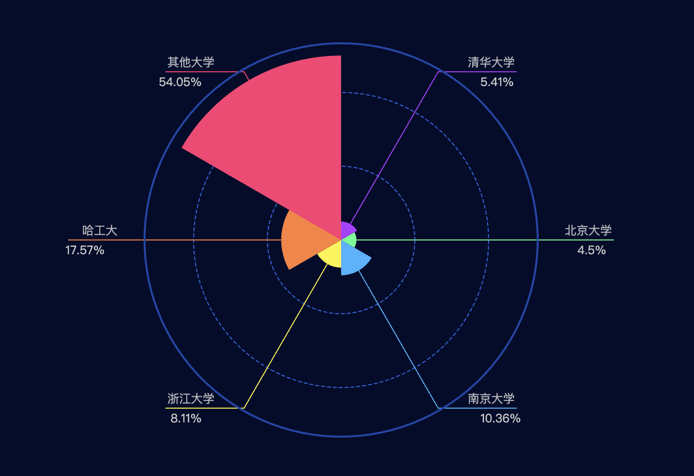
data: [{
"name": "清华大学",
"value": 12
}, {
"name": "北京大学",
"value": 10
}, {
"name": "南京大学",
"value": 23
}, {
"name": "浙江大学",
"value": 18
}, {
"name": "哈工大",
"value": 39
}, {
"name": "其他大学",
"value": 120
}]
}, {
name: '外边框',
type: 'pie',
clockWise: false,
hoverAnimation: false,
center: ['50%', '50%'],
radius: ['80%', '80%'],
label: {
normal: {
show: false
}
},
data: [{
value: 10,
name: '',
itemStyle: {
normal: {
borderWidth: 2,
borderColor: '#1a47aa'
}
}
}]
}]
};
myChart.setOption(option);
window.addEventListener("resize", function() {
myChart.resize();
})
点击运行 》