var colorArr = ["#218de0", "#01cbb3", "#85e647", "#5d5cda", "#f6d54a", "#f845f1"];
var colorAlpha = ['rgba(60,170,211,0.05)', 'rgba(1,203,179,0.05)', 'rgba(133,230,71,0.05)', 'rgba(93,92,218,0.05)', 'rgba(5,197,176,0.05)'];
var myProperty = {
titlefontsize: 14, //字体大小
polarradius: '60%',
pieradius: '60%',
length1: 10,
length2: 15,
};
var myData = {
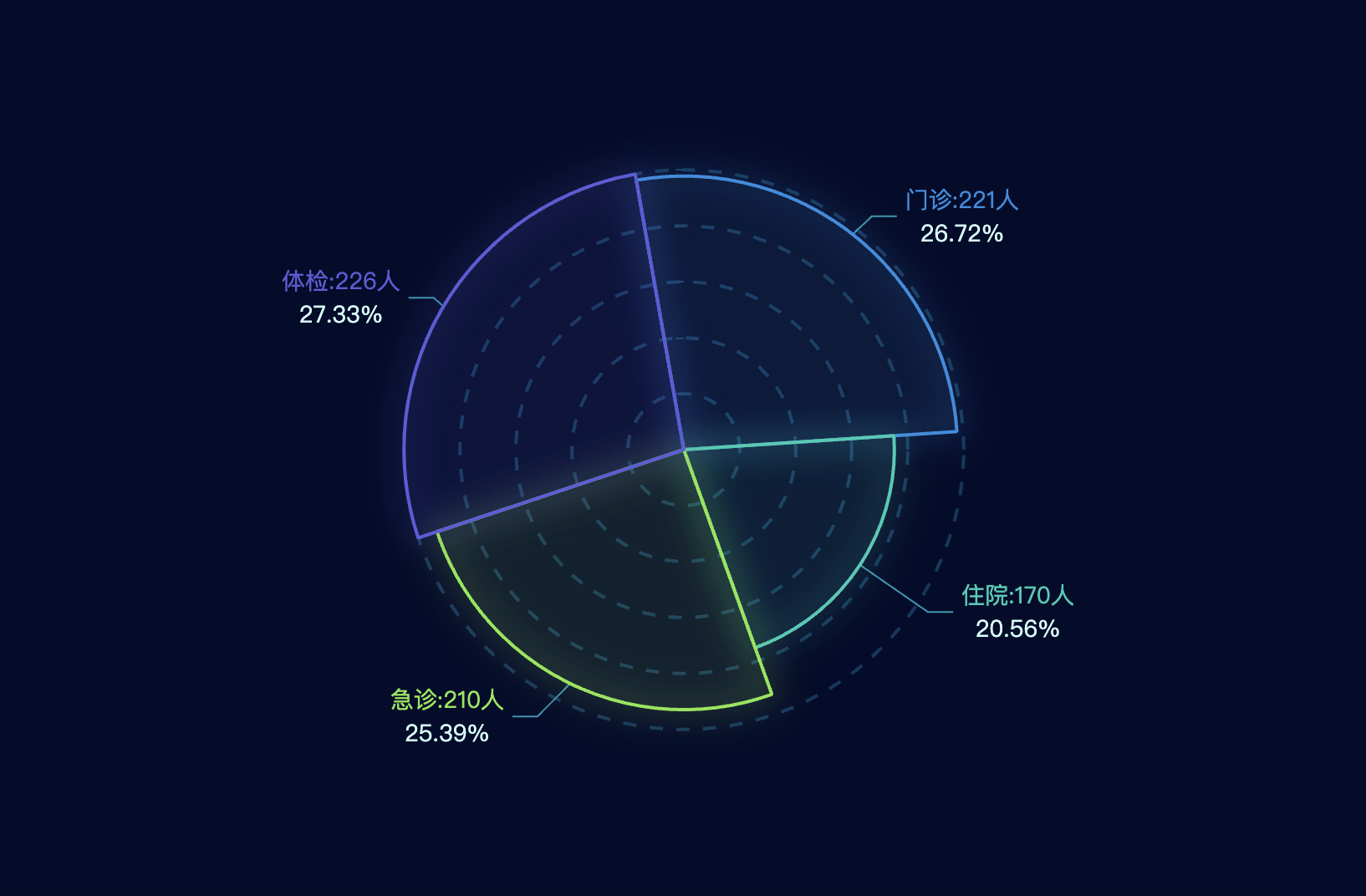
number: ['221', '170', '210', '226', '54'],
titlename: ["门诊", "住院", "急诊", "体检"],
};
var data = [];
var total = 0;
for (var i = 0; i < myData.number.length; i++) {
total += (Number)(myData.number[i]);
}
for (let index = 0; index < myData.titlename.length; index++) {
data.push({
value: myData.number[index],
name: myData.titlename[index],
itemStyle: {
normal: {
borderColor: colorArr[index],
borderWidth: 2,
shadowBlur: 20,
shadowColor: colorArr[index],
shadowOffsetx: 25,
shadowOffsety: 20,
color: colorAlpha[index]
}
},
label: {
normal: {
formatter: ['{b|{b}:{c}人}', '{d|{d}%}'].join('\n'), //join函数将数组中的元素用选择的分隔符拼接成一个字符串
rich: {
b: {
color: colorArr[index],
fontSize: myProperty.titlefontsize,
lineHeight: 20
},
d: {
color: '#d0fffc',
fontSize: myProperty.titlefontsize, //手动输入的字体大小
height: 20,
align: 'center', //这里是控制文本的位置 此时是居中
},
},
}
},
})
}
option = {
backgroundColor: "#030c2b",
grid: {
left: -100,
top: 50,
bottom: 10,
right: 10,
containLabel: true
},
polar: {
radius: myProperty.polarradius,
},
angleAxis: {
interval: 1,
type: 'category',
data: [],
z: 10,
axisLine: {
show: false,
lineStyle: {
color: "#0B4A6B",
width: 1,
type: "solid"
},
},
axisLabel: {
interval: 0,
show: true,
color: "#0B4A6B",
margin: 8,
fontSize: 12
},
},
radiusAxis: {
min: 20,
max: 120,
interval: 20,
axisLine: {
show: false,
lineStyle: {
color: "#0B3E5E",
width: 1,
type: "solid"
},
},
axisLabel: {
formatter: '{value} %',
show: false,
padding: [0, 0, 20, 0],
color: "#0B3E5E",
fontSize: 12
},
splitLine: {
lineStyle: {
color: "#07385e",
width: 2,
type: "dashed"
}
},
},
calculable: true,
series: [{
stack: 'a',
type: 'pie',
radius: myProperty.pieradius,
roseType: 'radius',
zlevel: 10,
startAngle: 100,
labelLine: {
normal: {
show: true,
length: myProperty.length1,
length2: myProperty.length2,
lineStyle: {
color: '#0096b1'
}
},
emphasis: {
show: false
}
},
data: data,
}]
};
点击运行 》