const ctx = document.getElementById('myChart');
const data = {
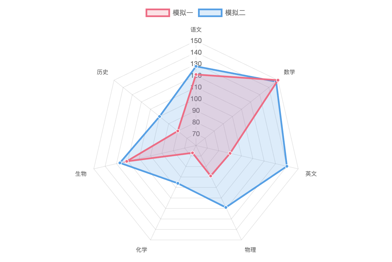
labels: [
'语文',
'数学',
'英文',
'物理',
'化学',
'生物',
'历史'
],
datasets: [{
label: '模拟一',
data: [121, 150, 90, 89, 67, 121, 80],
fill: true,
backgroundColor: 'rgba(255, 99, 132, 0.2)',
borderColor: 'rgb(255, 99, 132)',
pointBackgroundColor: 'rgb(255, 99, 132)',
pointBorderColor: '#fff',
pointHoverBackgroundColor: '#fff',
pointHoverBorderColor: 'rgb(255, 99, 132)'
}, {
label: '模拟二',
data: [128, 148, 140, 119, 96, 127, 100],
fill: true,
backgroundColor: 'rgba(54, 162, 235, 0.2)',
borderColor: 'rgb(54, 162, 235)',
pointBackgroundColor: 'rgb(54, 162, 235)',
pointBorderColor: '#fff',
pointHoverBackgroundColor: '#fff',
pointHoverBorderColor: 'rgb(54, 162, 235)'
}]
};
const config = {
type: 'radar',
data: data,
options: {
responsive: true, // 设置图表为响应式,根据屏幕窗口变化而变化
maintainAspectRatio: false,// 保持图表原有比例
elements: {
line: {
borderWidth: 3 // 设置线条宽度
}
}
}
};
const myChart = new Chart(ctx, config);
点击运行 》