//css代码
.main{
display: flex;
justify-content: center;
align-items: center;
height: 100vh;
}
.demost {
width: 500px;
height: 500px;
}
.demost .percentage {
width: 420px;
height: 420px;
}
.panClip {
width: 400px;
height: 400px;
background-color: #ccc;
border-radius: 50%;
position: relative;
overflow: hidden;
}
.panClip .percentage {
width: 300px;
height: 300px;
font-size: 50px;
color: #333;
background-color: #fff;
border-radius: 50%;
display: flex;
justify-content: center;
align-items: center;
transform: translate(-50%, -50%);
position: absolute;
top: 50%;
left: 50%;
z-index: 5;
}
.panClip .clipBox {
width: 100%;
height: 100%;
position: absolute;
border-radius: 50%;
clip-path: polygon(50% 0%, 50% 100%, 100% 100%, 100% 0%);
}
.panClip .clipBox .clipLeft,
.panClip .clipBox .clipRight {
width: 100%;
height: 100%;
border-radius: 50%;
background-color: #156fff;
position: absolute;
top: 0px;
left: 0px;
}
.panClip .clipBox .clipLeft {
clip-path: polygon(0% 0%, 0% 100%, 50% 100%, 50% 0%);
}
.panClip .clipBox .clipRight {
clip-path: polygon(50% 0%, 50% 100%, 100% 100%, 100% 0%);
}
.width-none {
width: 0 !important;
}
.clip_none {
clip-path: none !important;
}
.panClip .circular {
display: none;
width: 40px;
height: 40px;
border-radius: 50%;
background-color: #156fff;
transform: translateX(-50%);
position: absolute;
top: 0px;
left: 50%;
z-index: 3;
}
.panClip .corest {
width: 100%;
height: 100%;
transition: transform 2s;
position: absolute;
}
//div代码
<div class="main">
<div class="panClip demost">
<div class="clipBox">
<div class="clipLeft"></div>
<div class="clipRight width-none"></div>
</div>
<div class="percentage">0%</div>
<div class="circular"></div>
<div class="corest">
<div class="circular"></div>
</div>
</div>
</div>
//js
let demost = $('.demost').eq(0);
setTimeout(() => {
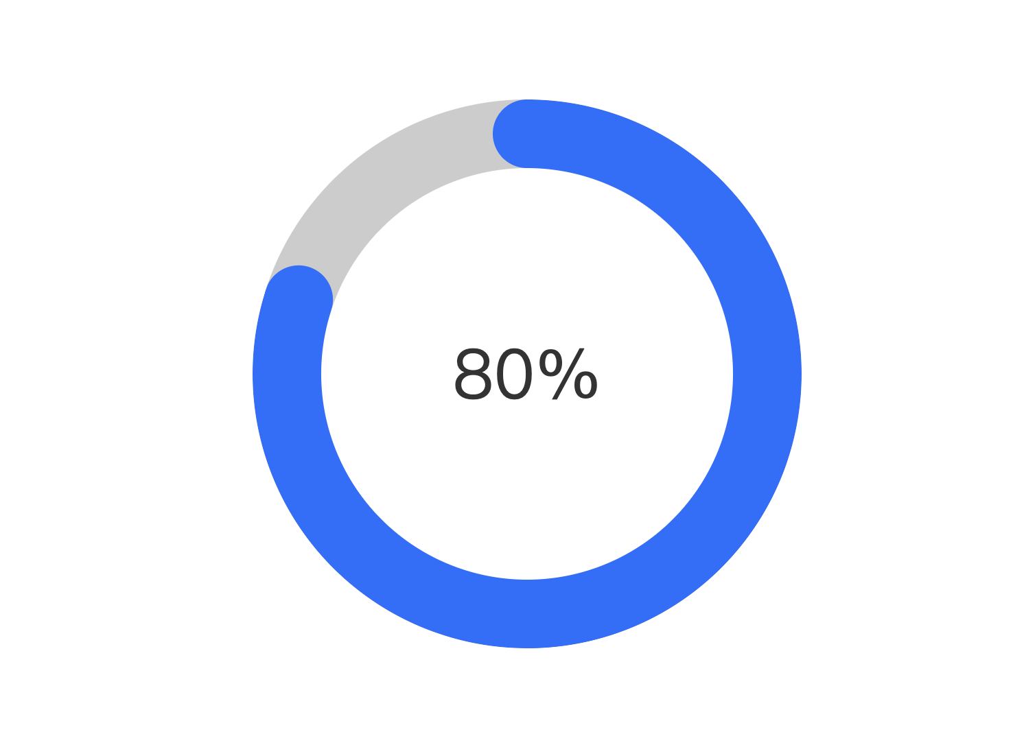
panClip(demost, 80);
}, 500);
function panClip(el, percentagest = 0, colort = '#156fff', callback) {
let clipst = el.children('.clipBox'),
circular = el.find('.circular'),
percentage = el.children('.percentage'),
corest = el.children('.corest'),
clipLeft = clipst.children('.clipLeft'),
clipRight = clipst.children('.clipRight');
let sizet = (el.width() - percentage.width()) / 2 + 'px';
clipLeft.css('background-color', colort);
circular.css({ width: sizet, height: sizet, 'background-color': colort });
if (percentagest >= 100) {
percentagest = 0;
clipRight.addClass("width-none");
clipst.removeClass("clip_none");
} else if (percentagest > 50) {
setTimeout(() => {
clipRight.removeClass("width-none");
clipst.addClass("clip_none");
}, 700);
}
if (percentagest > 0) circular.show();
clipLeft.css({ transition: '2s', transform: `rotate(${3.6 * percentagest}deg` });
corest.css({ transform: `rotate(${3.6 * percentagest}deg` });
percentage.html(`${percentagest}%`);
if (callback) callback();
}
点击运行 》